Innovate Space
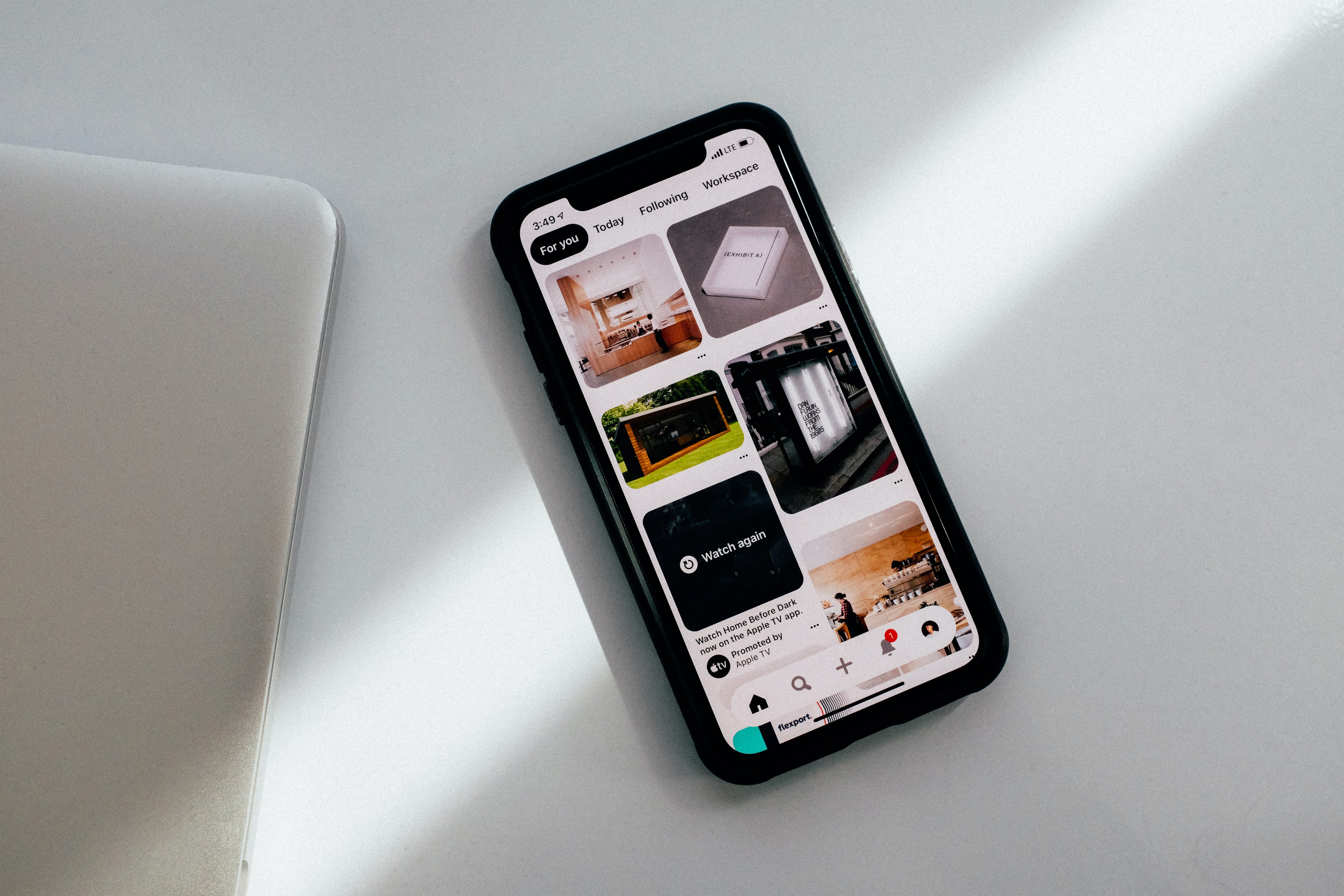
I helped visualise and design the mobile app for this innovative tech company
The Problem
Our client had an existing mobile app that was difficult to use and navigate. Users were abandoning the app at a high rate, and feedback indicated that the design was confusing and cluttered. The client approached us to redesign the app and improve user engagement.
The Solution
Our team conducted extensive user research to identify pain points and areas for improvement. We created a new user flow and wireframes that streamlined the navigation and simplified the design. We also updated the color scheme and added visual cues to guide users through the app. Finally, we conducted user testing to validate our designs and make necessary adjustments.

The Result
The redesigned app had a significant impact on user engagement and retention. User feedback was overwhelmingly positive, with many commenting on how much easier it was to use. In the first month after launch, there was a 25% increase in daily active users and a 20% decrease in app abandonment. The client was extremely satisfied with the results and reported an increase in revenue as a result of the redesign.
The Problem
Our client had an existing mobile app that was difficult to use and navigate. Users were abandoning the app at a high rate, and feedback indicated that the design was confusing and cluttered. The client approached us to redesign the app and improve user engagement.
The Solution
Our team conducted extensive user research to identify pain points and areas for improvement. We created a new user flow and wireframes that streamlined the navigation and simplified the design. We also updated the color scheme and added visual cues to guide users through the app. Finally, we conducted user testing to validate our designs and make necessary adjustments.

The Result
The redesigned app had a significant impact on user engagement and retention. User feedback was overwhelmingly positive, with many commenting on how much easier it was to use. In the first month after launch, there was a 25% increase in daily active users and a 20% decrease in app abandonment. The client was extremely satisfied with the results and reported an increase in revenue as a result of the redesign.
The Problem
Our client had an existing mobile app that was difficult to use and navigate. Users were abandoning the app at a high rate, and feedback indicated that the design was confusing and cluttered. The client approached us to redesign the app and improve user engagement.
The Solution
Our team conducted extensive user research to identify pain points and areas for improvement. We created a new user flow and wireframes that streamlined the navigation and simplified the design. We also updated the color scheme and added visual cues to guide users through the app. Finally, we conducted user testing to validate our designs and make necessary adjustments.

The Result
The redesigned app had a significant impact on user engagement and retention. User feedback was overwhelmingly positive, with many commenting on how much easier it was to use. In the first month after launch, there was a 25% increase in daily active users and a 20% decrease in app abandonment. The client was extremely satisfied with the results and reported an increase in revenue as a result of the redesign.
Want to work with me?
Get in touch and lets see how we can work together and make your next project a successful one
